As a UI Designer at Comparison Technologies, I redesigned the product page on Mobile-Phones.co.uk. In this case study, I’ll talk through my process of refining the visual hierarchy, simplifying the user journey and creating a cleaner, more engaging experience that helped increase conversions.
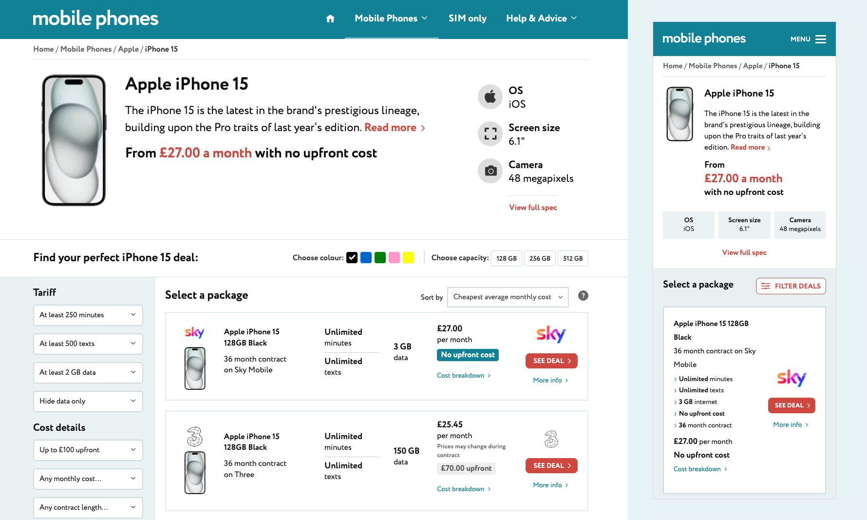
When I looked at heatmaps of our product pages on mobile-phones.co.uk, I noticed users weren't really interacting with choosing a phone's colour or storage size. It wasn't surprising; these options were hidden away in the top-right corner, making them easy to overlook, especially on mobile devices.
Further down, the comparison table also needed improvement. On mobile, it was difficult for users to quickly see important details like data allowance and storage options. Overall, it felt cluttered, outdated and hard to scan.

First, I tackled the hero section. I moved the colour and storage options front and centre, making them impossible to miss. This created a clear starting point, helping users immediately get involved and start building their phone package. At the same time, I cleaned up the visual design to make it feel modern and spacious, giving the page a much fresher look.

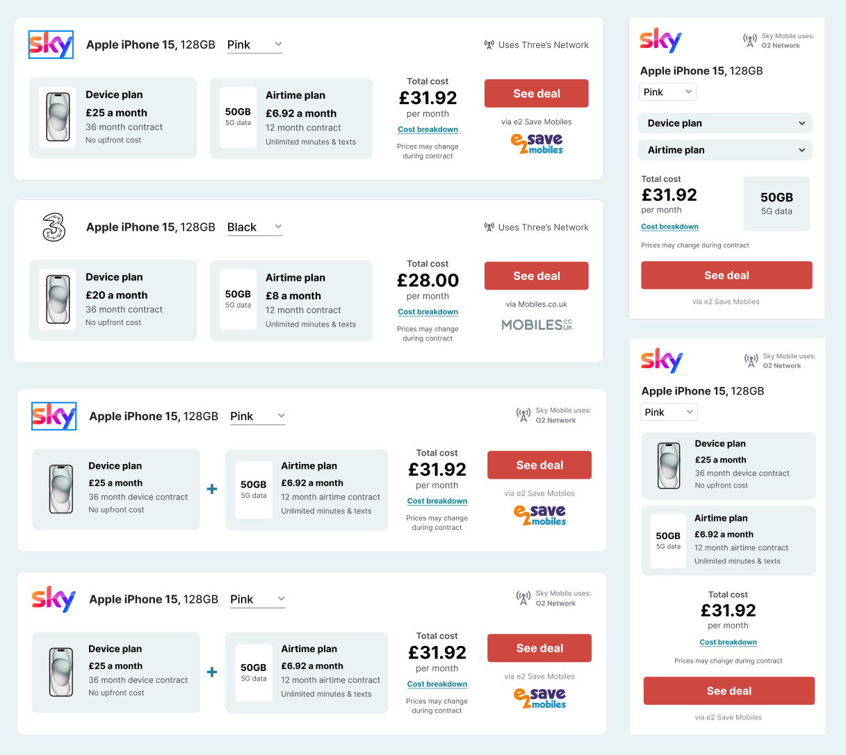
Next came the comparison table. Before jumping into designs, I took screenshots of as many competitor comparison tables as I could find. I brought all of these into Figma, creating a mood board to identify what worked best and what to avoid. This research helped me see clear patterns and sparked ideas for our own redesign.
With inspiration set, I worked through multiple design iterations. My main goal was making sure key information stood out clearly. I made big improvements to the mobile view, allowing users to quickly compare deals without having to hunt for details.
Below are some examples of the design iterations I worked on...

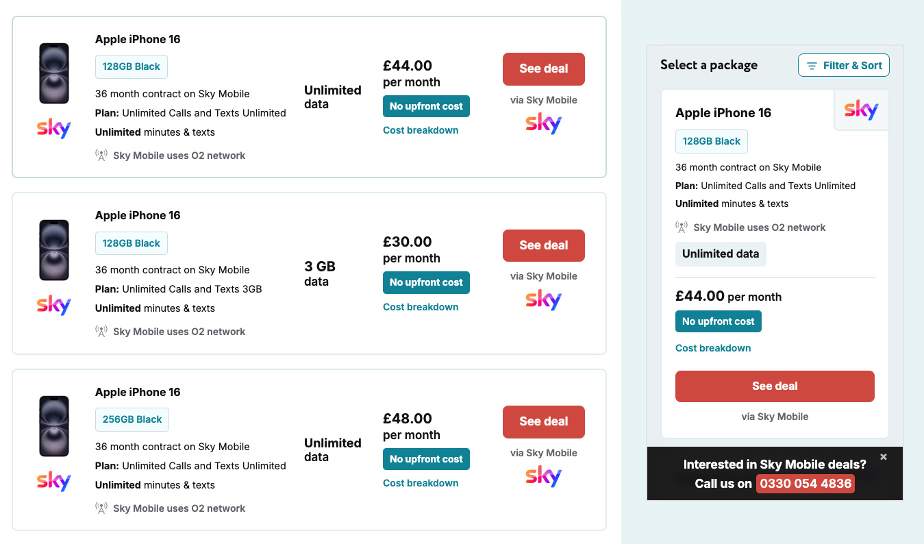
Before settling with the final design...

The improvements had a clear impact. Looking at heatmaps and GA events, I saw users engaging more with the colour and capacity selectors. We also noticed a significant increase in click-through rates on our comparison table, especially on mobile.
Overall, the redesign made the product page easier to use and helped users find exactly what they needed quickly and confidently.