
As the owner and designer of Marriage Gift List, I handle everything from the design and development to the overall user experience. In this case study, I'll show a recent change I made to the onboarding process, aiming to reduce friction and let users try out the platform before they commit to signing up.
Previously, users had to fill out a pretty long sign-up form before they could even see how the platform worked—understandably, this caused a lot of frustration and drop-off. Many people left before they got the chance to explore and see if the platform was right for them.
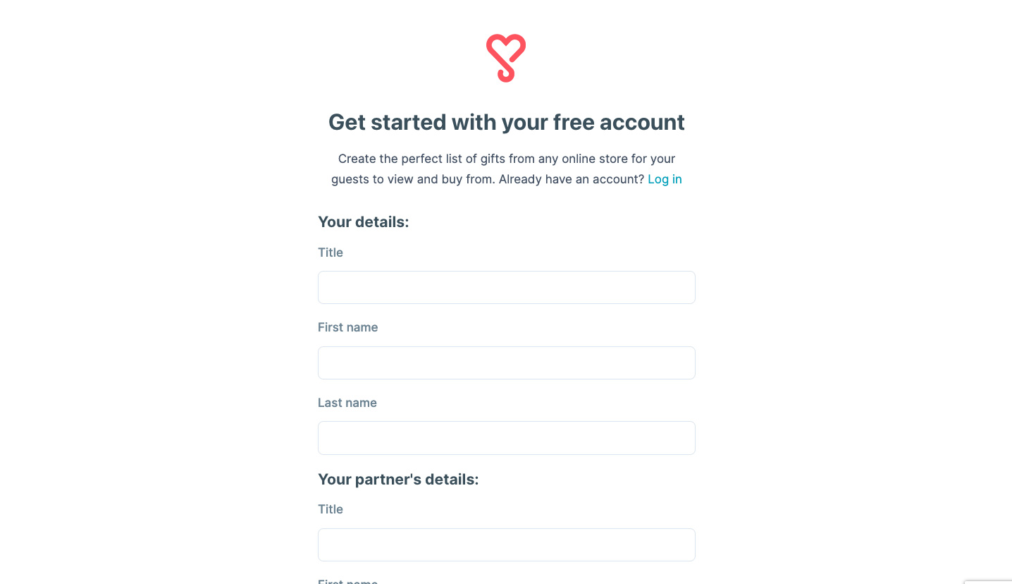
I redesigned the process to create a "Try Before You Sign Up" experience. Instead of forcing users to register immediately, they can now jump straight into the platform and test it out. Specifically, they can:
As users start adding gifts, they naturally provide details like their names, profile picture, wedding date, and a welcome message. So when it does come time to register, most of their information is already captured. The final sign-up then feels quick and easy, requiring just an email address and password.
This approach helps users experience the platform’s value first-hand, significantly reducing the barrier to signing up.
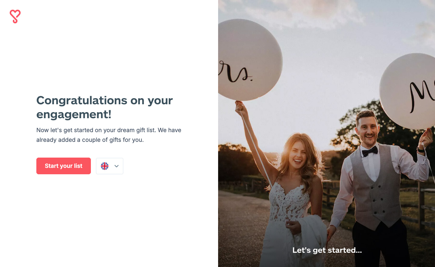
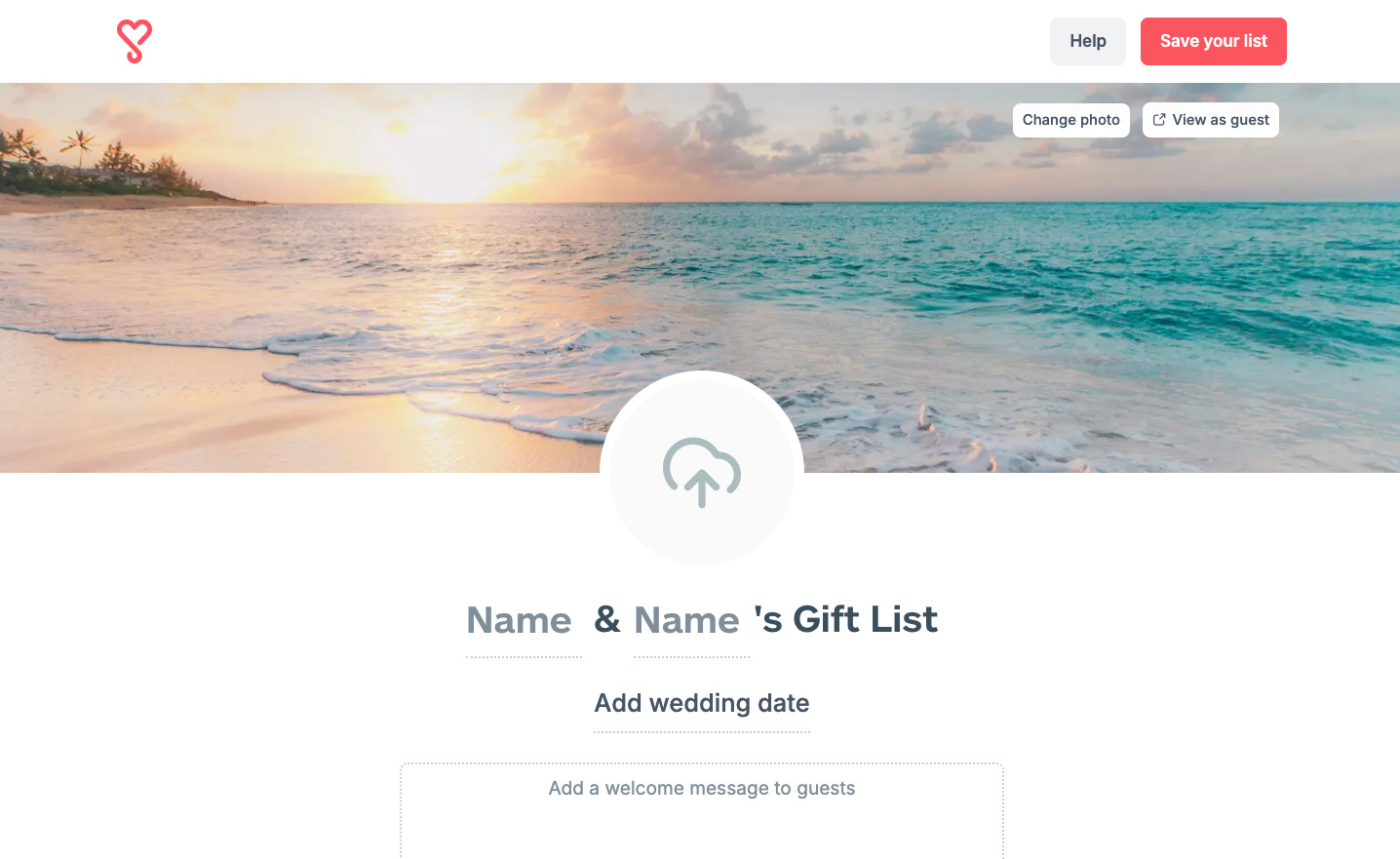
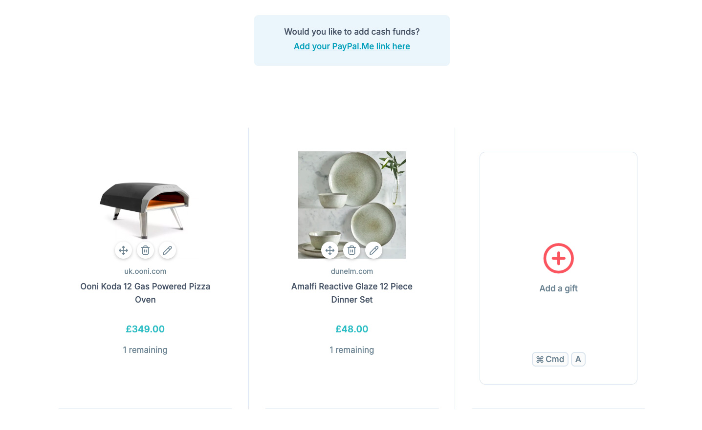
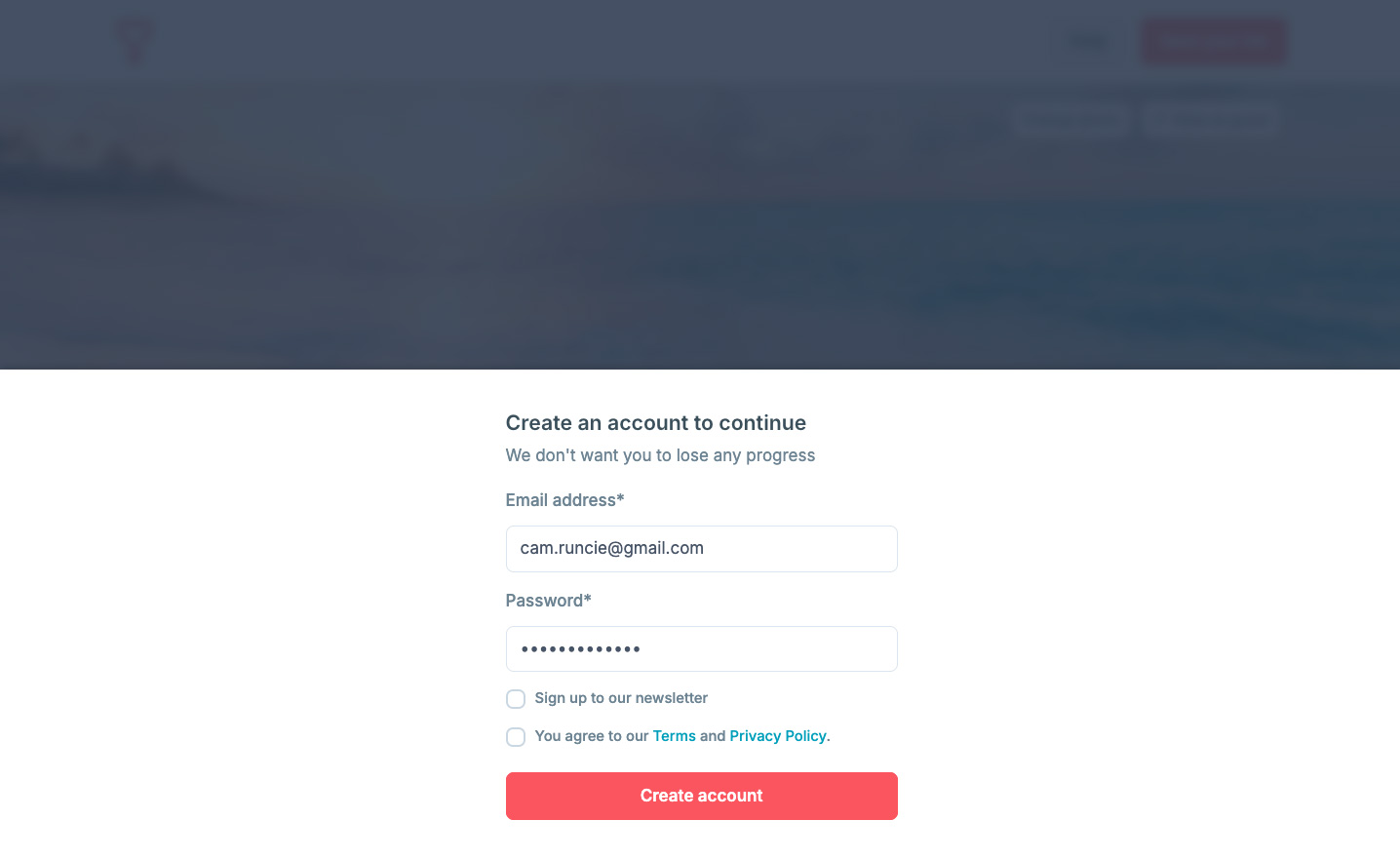
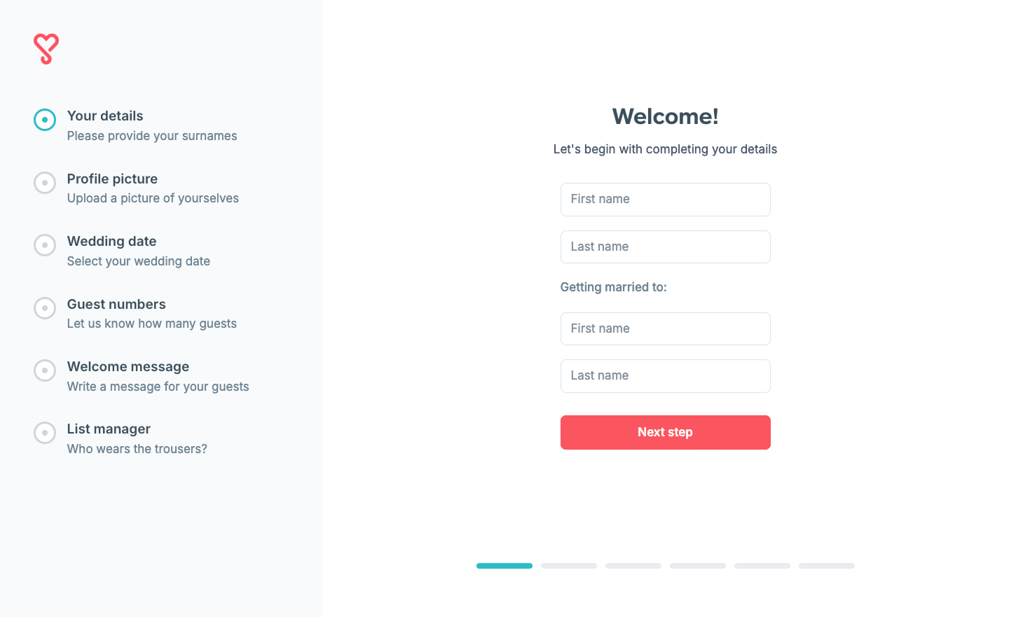
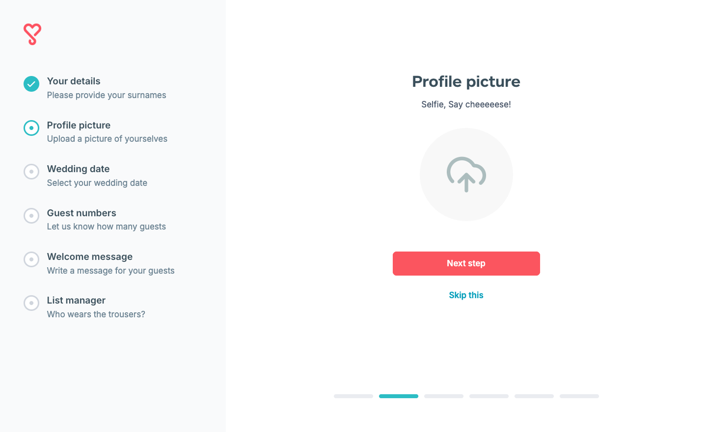

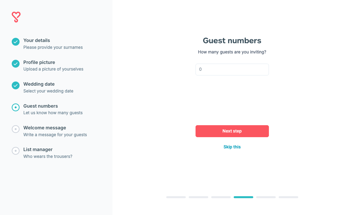
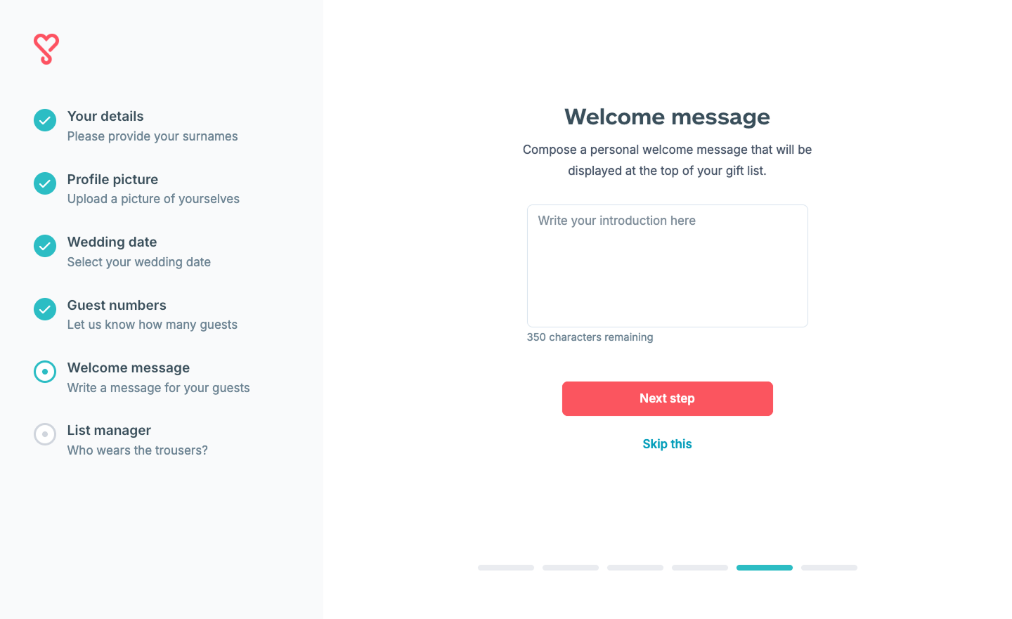
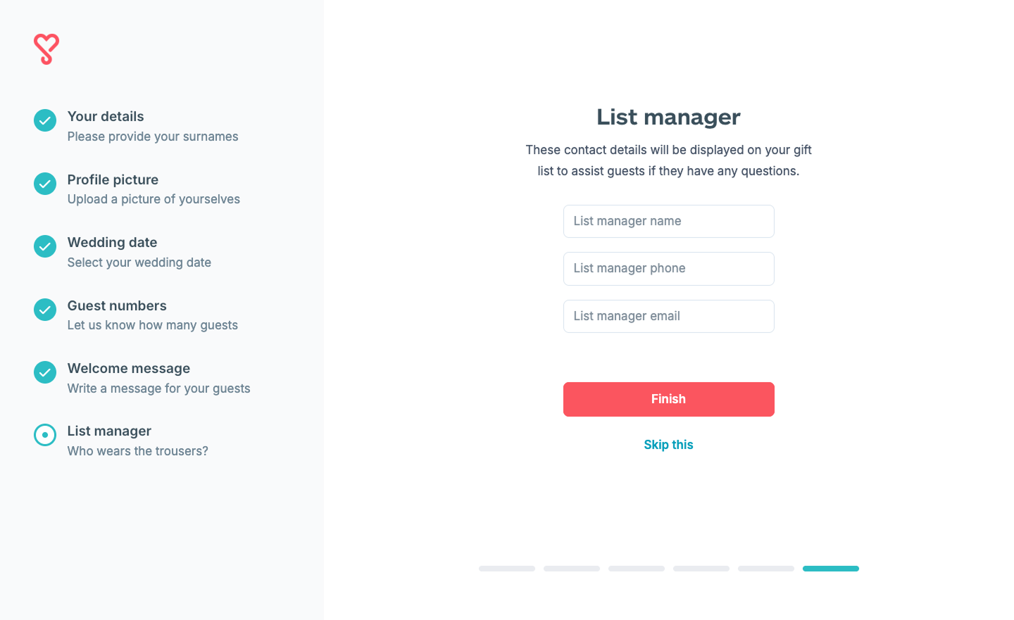
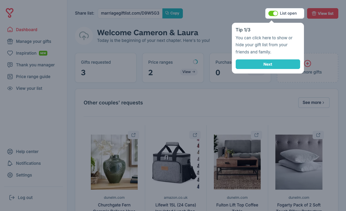
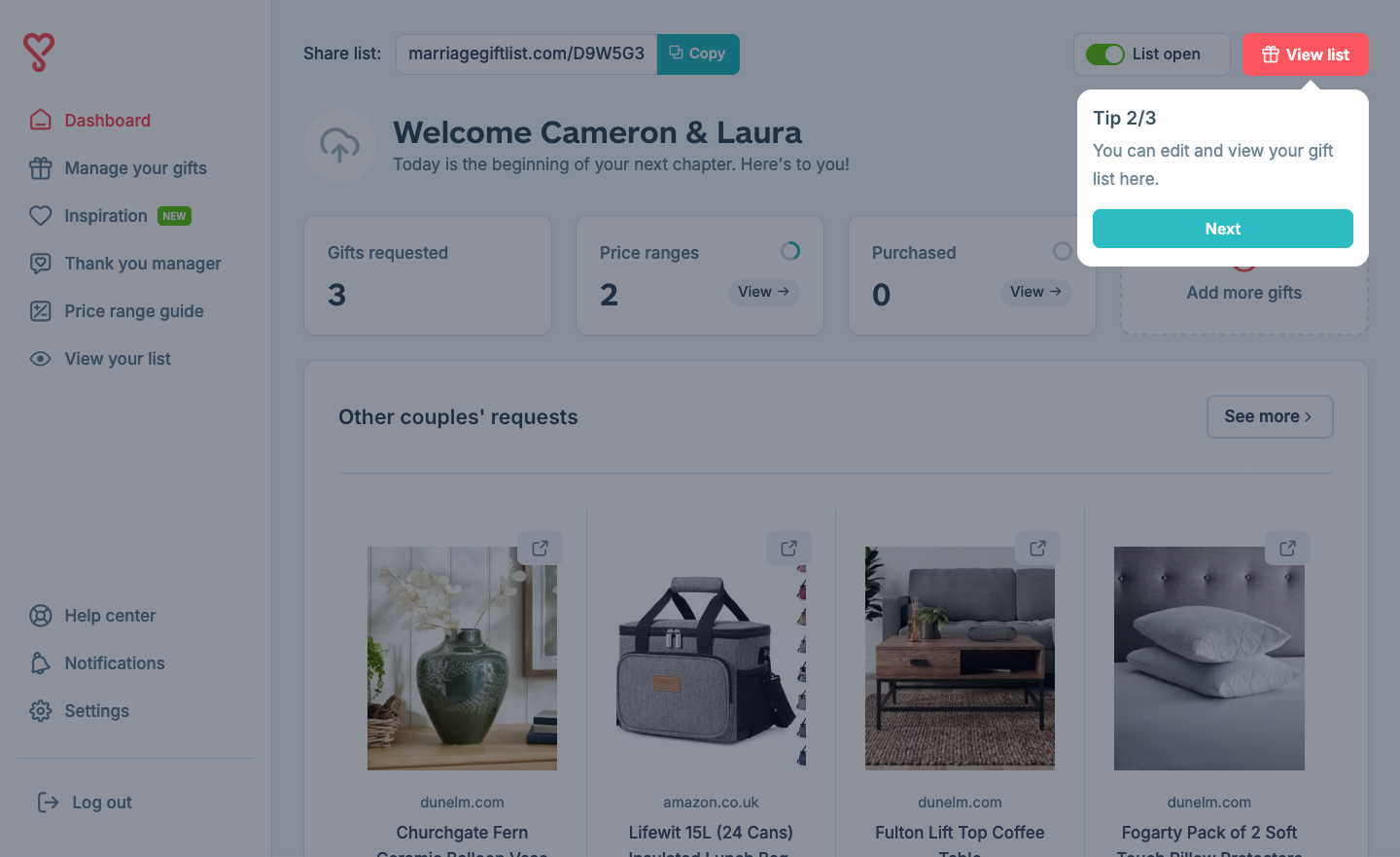
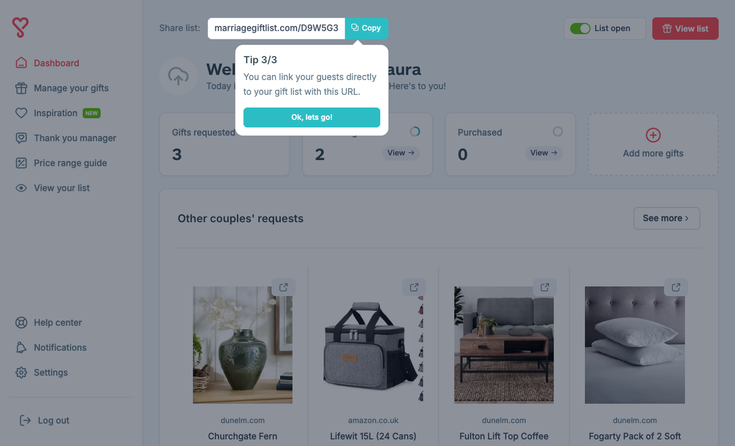
Since introducing this new flow, user engagement has noticeably increased. Allowing people to try the platform before committing has helped reduce friction and build trust early on in the experience.
Overall, by letting users explore first, more people are signing up confidently, knowing exactly what value they're getting.