As a UI Designer at Comparison Technologies, one of my projects was to improve the comparison table on Digital-TV.co.uk. In this case study, I'll walk you through how I refreshed the design. Creating a cleaner, modern look and making key information easier and quicker for users to scan.
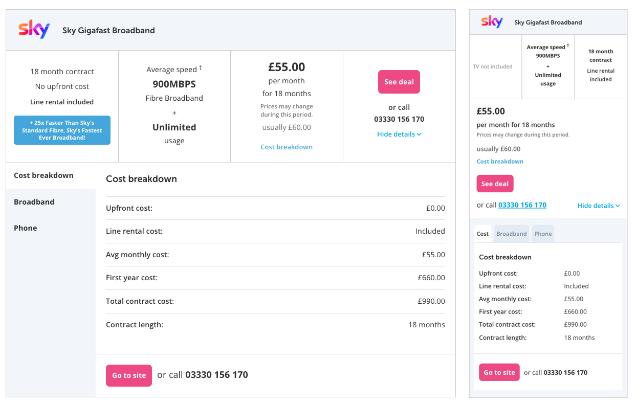
The comparison table on Digital TV had always performed strongly, consistently driving click-throughs. However, over time, it started to feel outdated, cluttered, and difficult for users to scan quickly. Each package included a lot of information, with extra details hidden in dropdowns that became overwhelming when expanded.
I realised it was time for a visual refresh, but since the current table performed well, any change needed to be carefully considered and validated with data.
I began by looking at what competitors were doing. I took screenshots of every relevant table I could find and created a detailed mood board in Figma, which gave me clarity on what worked well and what didn't.
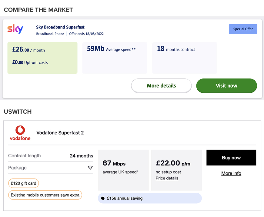
One thing that stood out to me from competitors like Uswitch and Compare the Market was their use of clear, distinct blocks and backgrounds to visually separate key package information. This gave users an easier, more intuitive way to scan and compare deals quickly. I wanted to use a similar visual structure for our table.
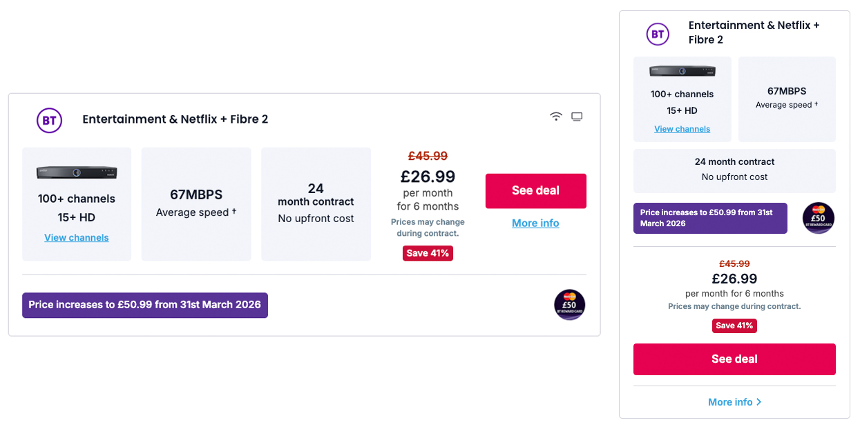
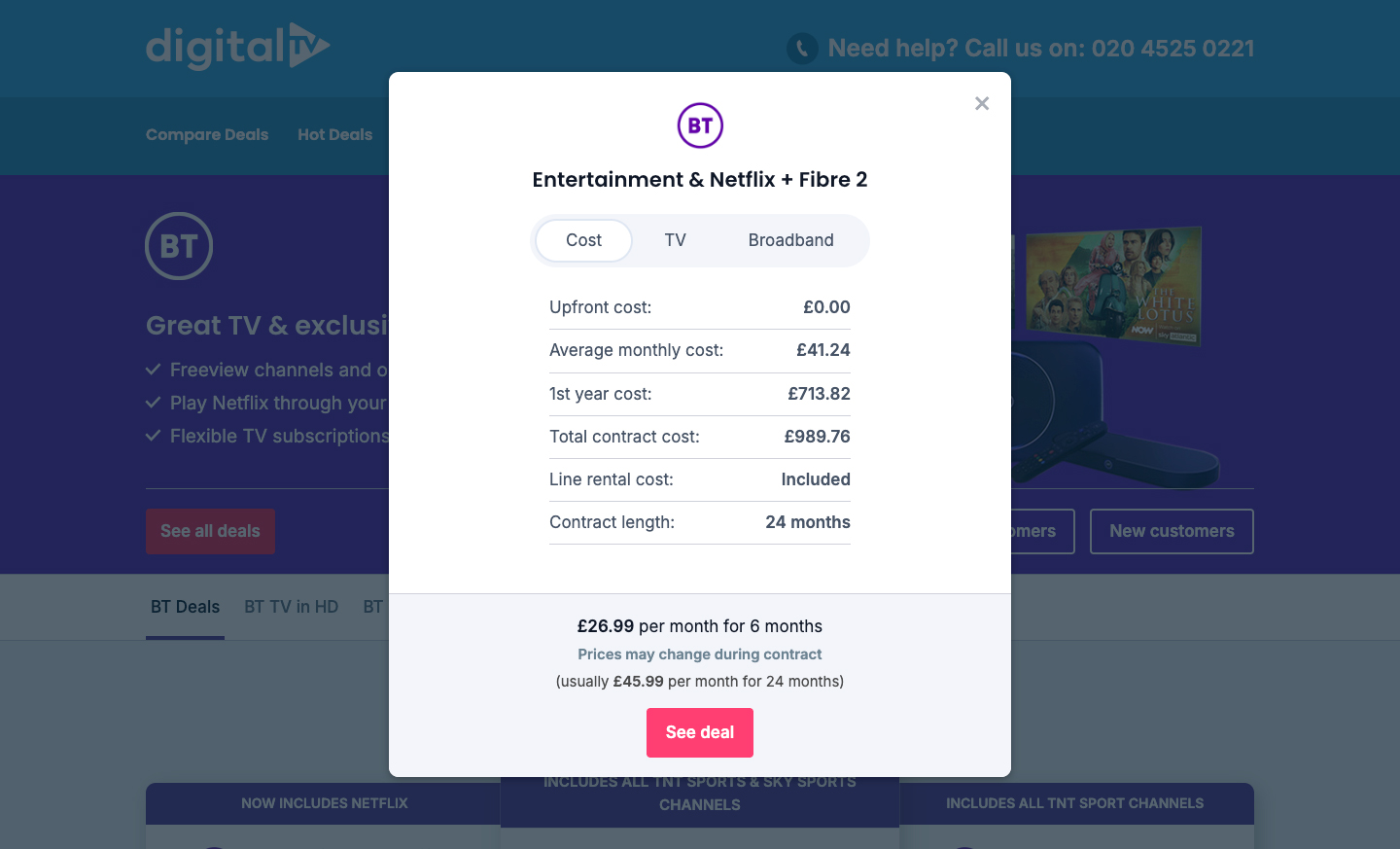
I’m really pleased with how the redesign turned out. I broke out the most important content into clearly defined sections, and moved the extra details into a structured, easy-to-use modal. I also added a new feature showing the percentage discount for each package — helping users instantly spot the best-value deals.
To measure the impact objectively, I ran the new design as an A/B test against our existing table, tracking click-through events carefully in Google Analytics.
The redesigned table performed strongly in testing, improving an already successful experience by clarifying key information and helping users find their best package quickly. Click through data from GA clearly showed that users engaged positively with the refreshed, modern layout.
Ultimately, this redesign didn't just improve aesthetics, it helped users compare deals faster and easier, leading to increased CTR / call volume and a stronger overall user experience.
